Short answer: if you are unsure, choose white or off-white matched to your window trim. It is the safest choice for blinds and shutters, it suits almost any wall color, and it is what a future buyer expects. Move away from white for a reason: a darker solar shade gives a clearer view out and calms glare, a stained wood brings warmth, and a contrasting color makes the window a feature. Then check the sample in the room's own light before you order.
Should blinds match the trim or the walls?
There are three ways to do it, and all three work in the right room.
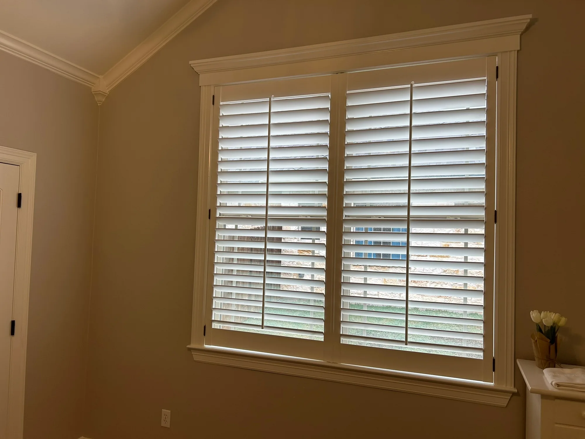
- Match the trim. The most common choice. Blinds and shutters mounted inside the frame read as part of the window, so the walls, floors and furniture carry the room.
- Go tone-on-tone with the wall. A color a shade or two lighter or darker than the wall. This suits fabric shades and rooms with colored walls, where white would stand out.
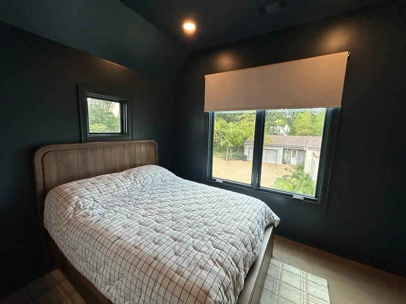
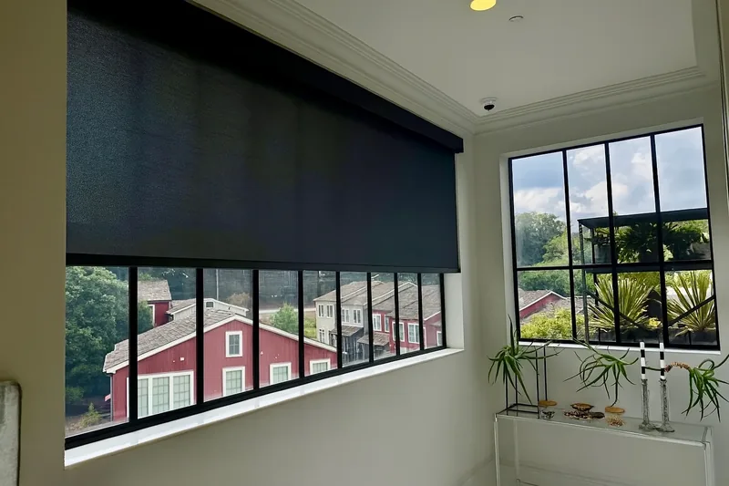
- Contrast on purpose. Dark against white walls, or light against dark walls. The window becomes a feature, which works when the window is worth looking at.
Whichever you choose, mind the undertone. Whites differ: some lean warm and creamy, others cool and blue. A cool white blind next to a creamy trim looks dingy, and the reverse looks yellow. Match warm to warm and cool to cool, and hold the sample against the actual trim paint, since two whites can look identical on their own and different side by side.
Popular blind colors and when each one works
- White: the default. Matches most painted trim, brightens the room, easy to live with.
- Off-white, cream and ivory: softer than white and better with warm, creamy trim and beige or greige walls.
- Gray: suits cool-toned rooms and gray walls. Pick a gray that leans the same way as the wall.
- Beige and greige: blends with warm neutral walls and wood floors without drawing attention.
- Black and charcoal: a modern look that lines up with black window frames.
- Bronze and brown: warm, calm, and often the best color for seeing out through a solar shade.
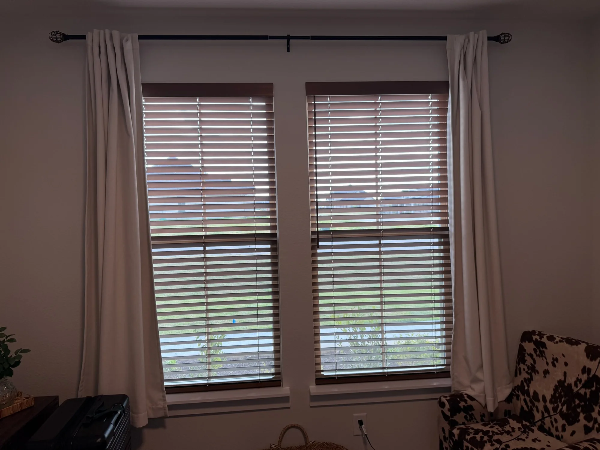
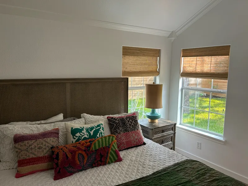
- Wood tones and natural weaves: warmth and texture from real wood, stain or woven materials.
What light and dark colors actually do
| Effect | Lighter colors | Darker colors |
|---|---|---|
| Heat | Reflect more of the sun's energy back out through the glass | Absorb more of it at the window and give some of that heat to the room |
| View through solar fabric | Hazier, because the weave lights up in sun | Clearer, because the weave reflects less light toward your eyes |
| Glare | The fabric glows on bright days | Calmer, which helps rooms with screens |
| Room feel | Small rooms feel larger and brighter | Large rooms feel cozier |
| Dust and marks | Hide dust, show smudges | Show dust, hide smudges |
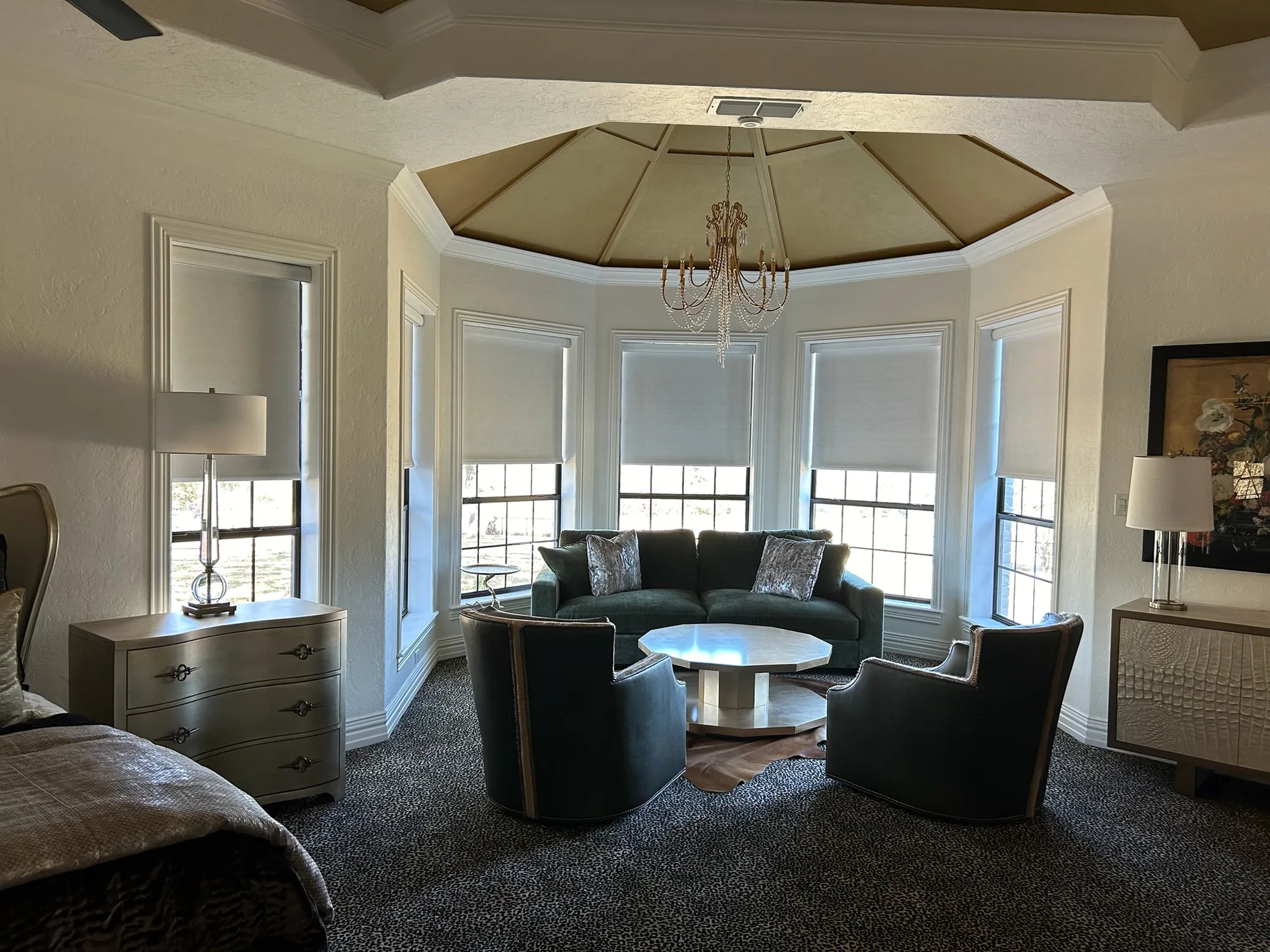
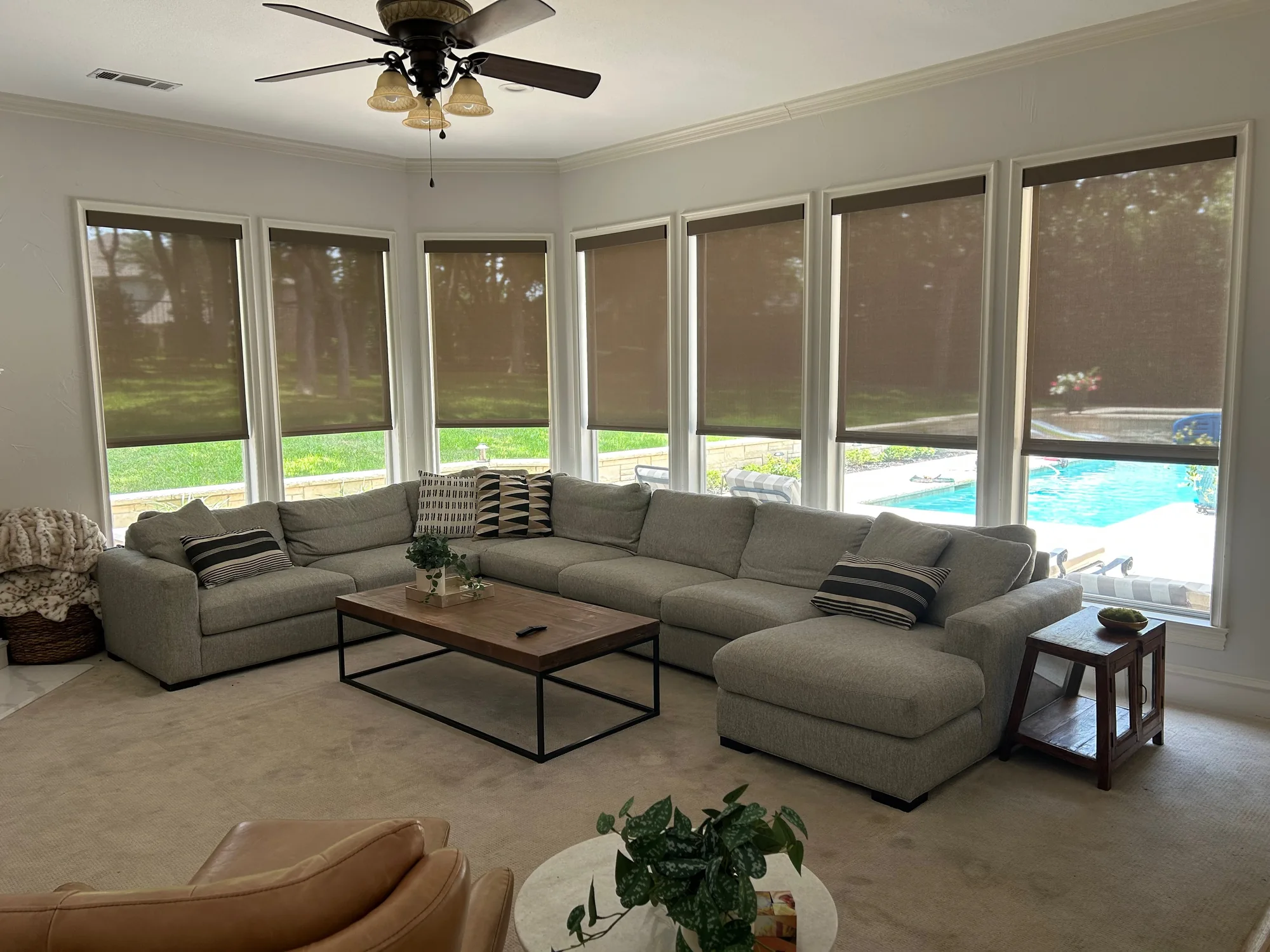
For solar shades, the view difference is often big enough to decide the color by itself. In the living room at the top of this page, bronze solar shades keep the lawn and pool in sight with the shades down. A white fabric at the same openness would look like a bright wall in the afternoon sun. If heat matters more than the view, a lighter fabric is the better trade.
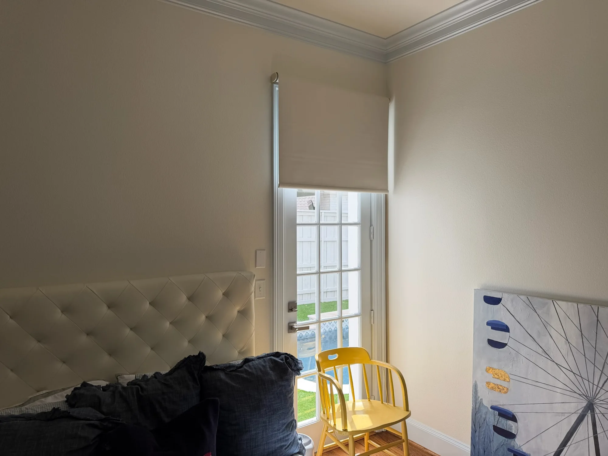
For blackout, color plays a small part in how dark the room gets. The fabric's opacity does most of the work, and the gaps around the edges let in more light than any face color. More on that in room-darkening vs blackout.
Floors, wood tones and stains
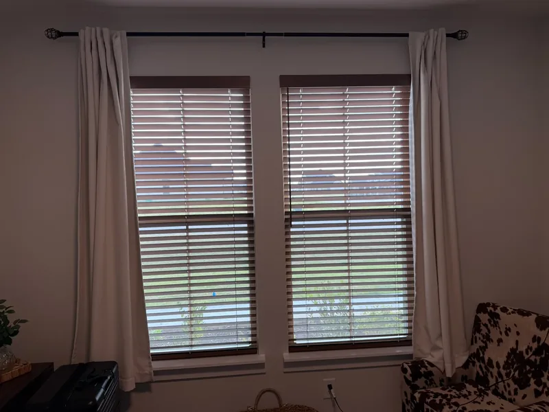
Real wood blinds and shutters take a true stain, so they can match floors, cabinets or doors, or contrast with them deliberately. Faux wood cannot take a real stain, which is one reason painted white faux wood is the usual pick for kitchens and bathrooms. Our guide to faux wood vs real wood blinds covers where each belongs. A stained window becomes a warm feature, and in strong afternoon light a mid-tone stain can look redder than it did in the sample, so look at it at the window.
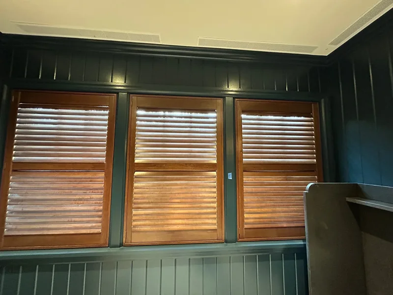
Natural woven woods sit between painted and stained. They bring a mid-tone and texture without a strong color, and they get along with nearly any wall and floor.
How your house looks from the street
Blinds and shutters are the same color on both sides, so the color you pick for the room is the color the street sees. Fabric shades show their back to the street, and that side can look different from the room side. If a front room calls for a bold or dark color, look at a sample from outside before deciding, and keep the street-facing windows consistent so the front of the house reads as one design. Some neighborhood covenants also address how window coverings look from the street, so check yours.
Color by room
- West-facing living rooms: a mid to dark solar fabric for the view and the glare, or a lighter one if heat is the bigger problem.
- Bedrooms: any color you like on a blackout or room-darkening fabric.
- Media rooms: a darker color facing the room keeps reflected light off the screen. See window treatments for media rooms.
- Kitchens and bathrooms: white or light colors in moisture-tolerant materials, which wipe clean and suit painted cabinets.
- Rooms with drapery: keep the blinds or shades quiet and let the drapery bring the color.
How to test colors before you order
- Hold each sample at the window, at the time of day the room gets used.
- Look at it against both the trim and the wall.
- Compare a light and a dark version of the same fabric side by side.
- Look at front-room samples from the street at dusk.
- Make final calls in person; screens shift colors.
We bring samples to your home at the free in-home consultation for this reason. A color under store lighting or on a phone is a different color in your west-facing room at five o'clock.
Colors that age well
White and soft neutrals stay in style longest and suit a future buyer, which is why they are the default for blinds and shutters. If you want a bold color, put it in drapery, which is easier to change than a house full of shades. Most fabrics fade over years of direct sun and saturated colors show it first, so keep the strongest colors off the hottest west windows.